Say “hello” to the Lottie Suite. By blending my love for design and travel, I’ve broken down what my influence was to create this entire invitation suite. I’m going to cut right to the chase, it’s Amsterdam! My adoration for travel often plays a large role in my designs. For my 40th (shhhhhh, don’t tell anyone!) birthday, my husband and I traveled to Amsterdam for a celebratory holiday. I hope to inspire you to imagine your wedding invitations in the same way as the city of Amsterdam has inspired me to design the Lottie Suite.

When you dream about your wedding invitations, what do they look like? What makes them unique to you as a couple? Is it the color palette, the artwork, the font choices or all of the above?
These are just a few questions I like to ask my wedding clients as we begin the designing process. It’s so important to portray the collective ‘you’ in your invitations. This may be a subtle nuance, such as incorporating watercolors into each invitation insert for a soft, romantic feel or a logo or emblem of your initials, signifying the union of your marriage or highlighting the ceremony and/or reception venue that will forever be a part of your history. I love a good love story! To cherish yours in a way that is documented on paper will be your forever keepsake.
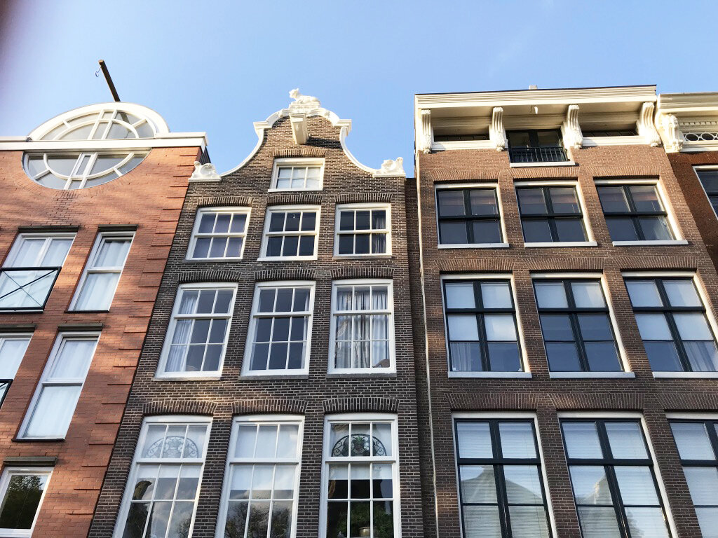
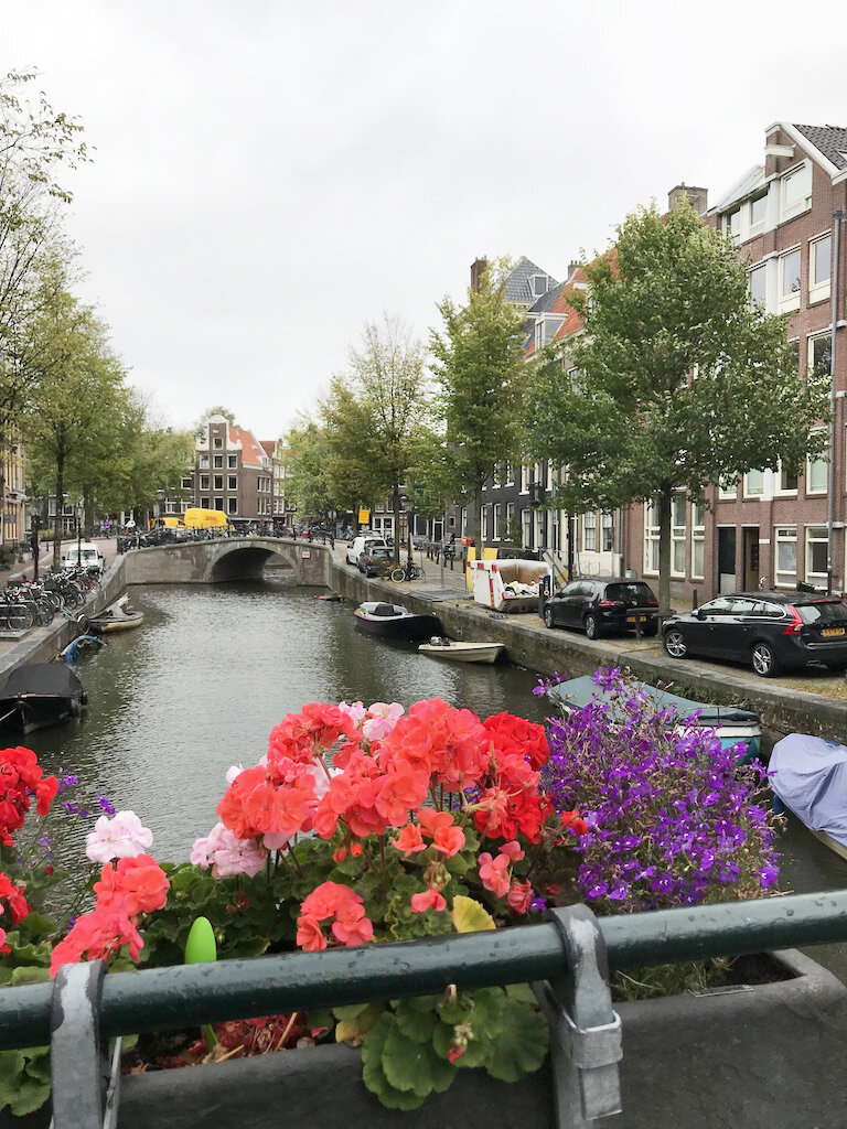
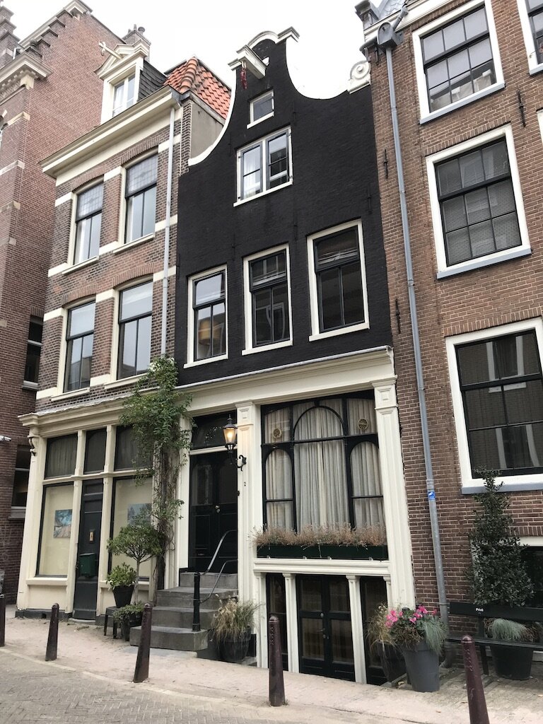
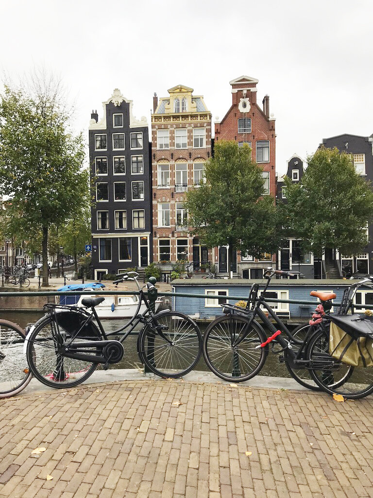
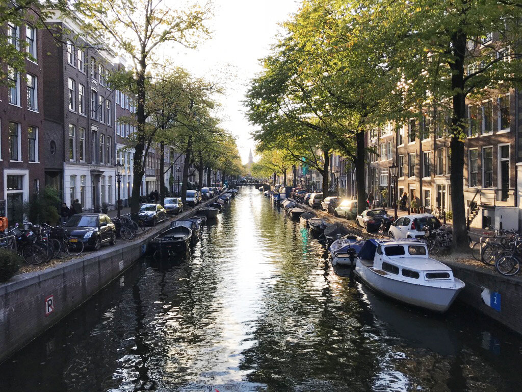
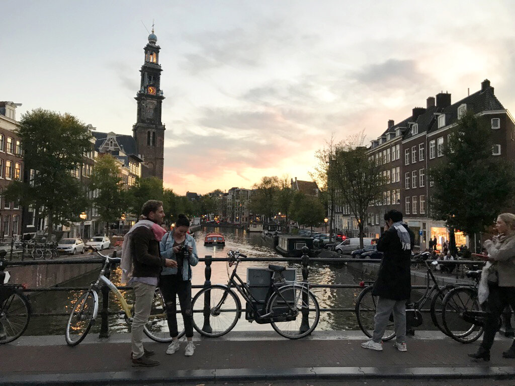
I immediately fell in love with the architecture of Amsterdam. From the rows and rows of canal houses that are tall, skinny, and each unique in their own right, particularly the crooked ones, to the bicycle culture that is so Dutch to the old, rich history that is what makes Europe so different from America. Nearly two hundred canals run through the city, carving out a rare landscape. Beautiful bridges galore! The entire city is built on millions of pylons imported from the Black Forest of Germany, hence so many crooked row houses and buildings.
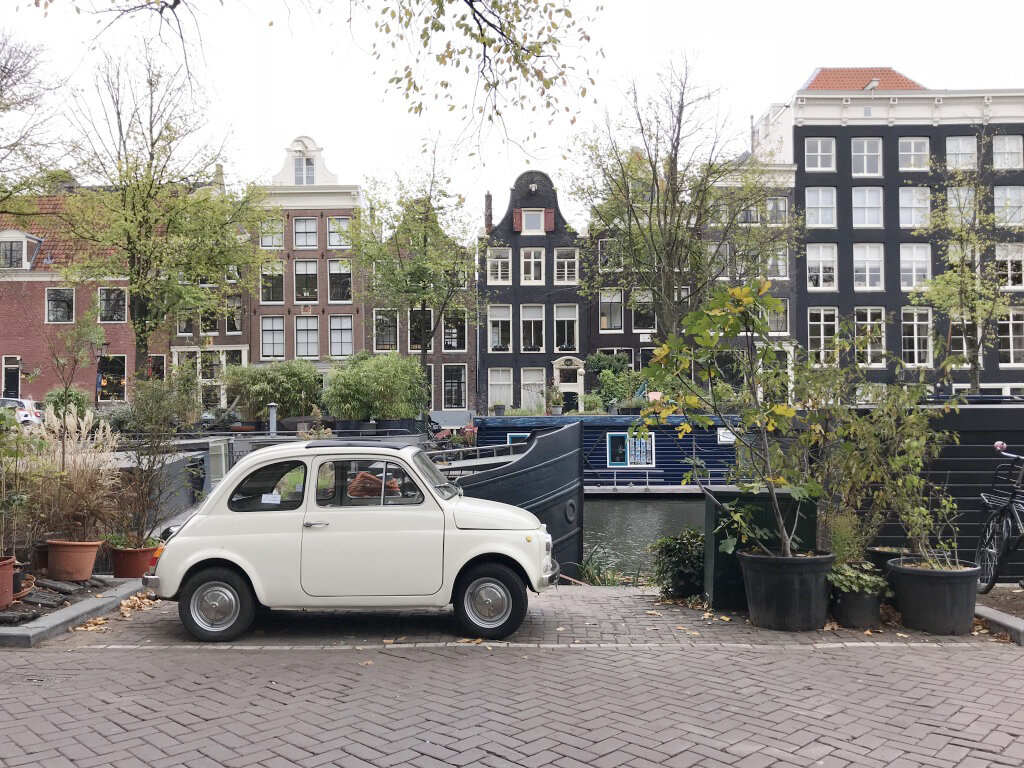
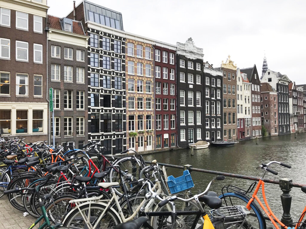
I could go on an on about the history of Amsterdam, but alas, this is not a history lesson. Instead, I will interpret the design of the Lottie Suite and the inspiration behind it. It is minimal and clean. Similar to the vibe of the people who inhabit the city and the city itself. Meaning, Amsterdam has left the flamboyant flair to other European cities. While the buildings and museums in the city are exquisite, the over-the-top “extra” is devoid, leaving a beautifully simple cityscape. The people of Amsterdam are the most friendly and welcoming people I’ve come across in all of our travels to date. The calm, cool, collected nature that is ingrained in this society is enviable.
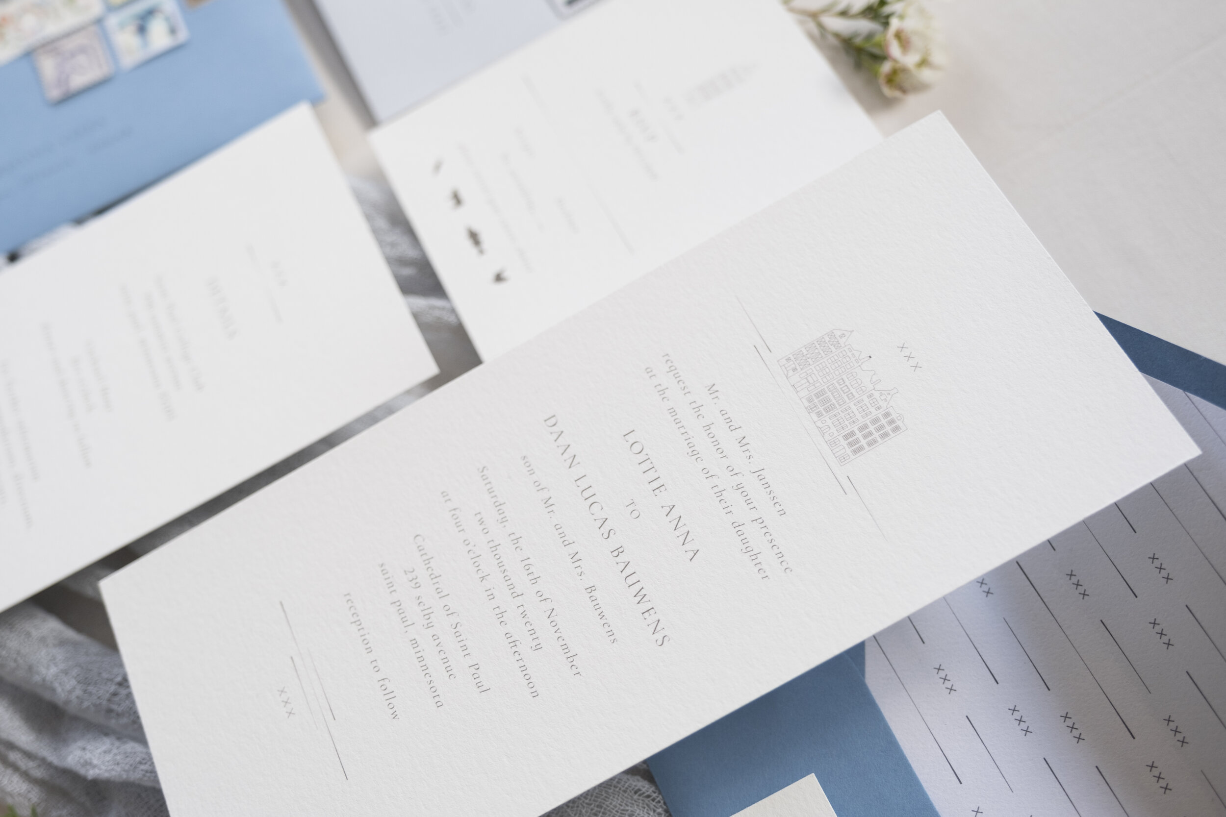
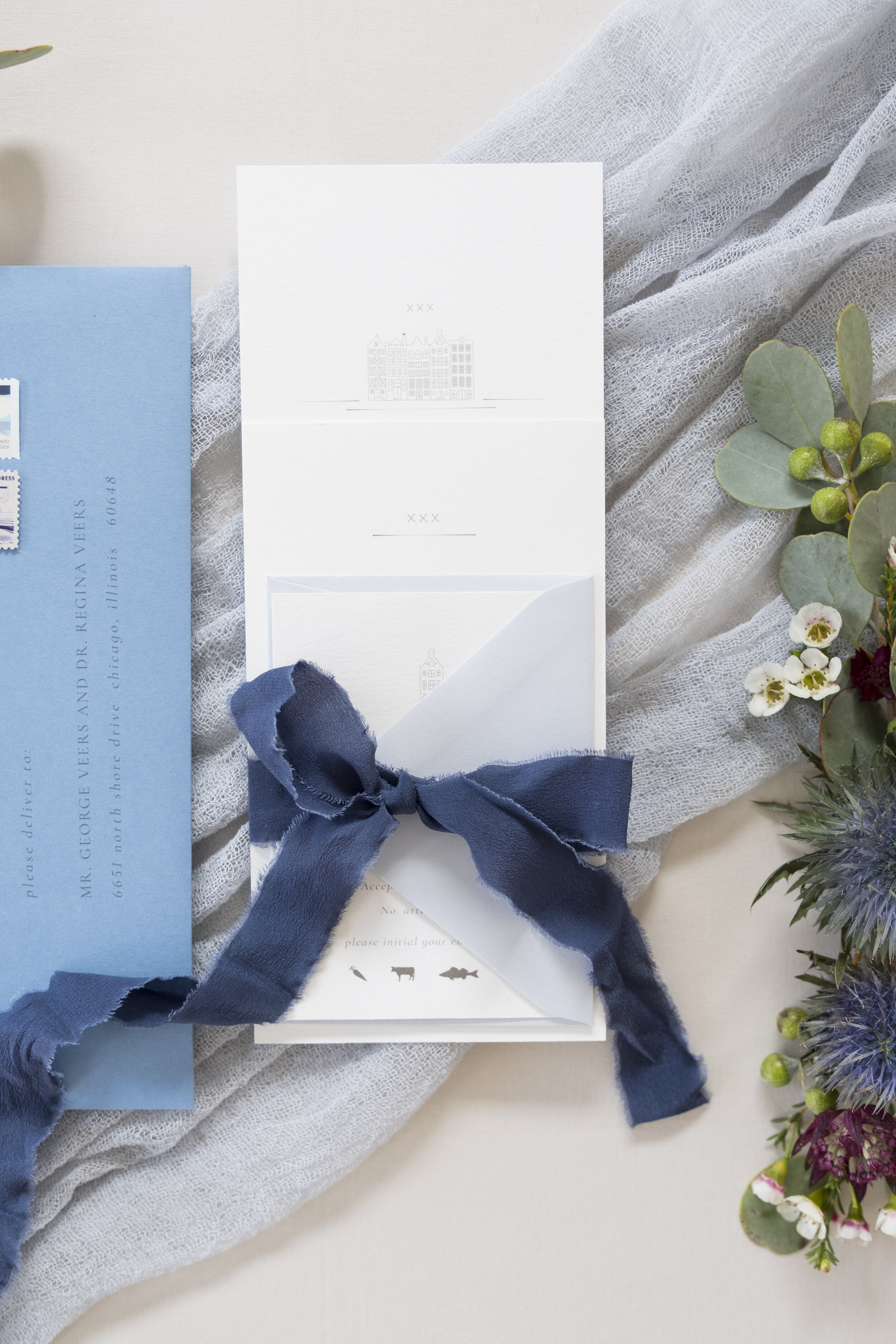
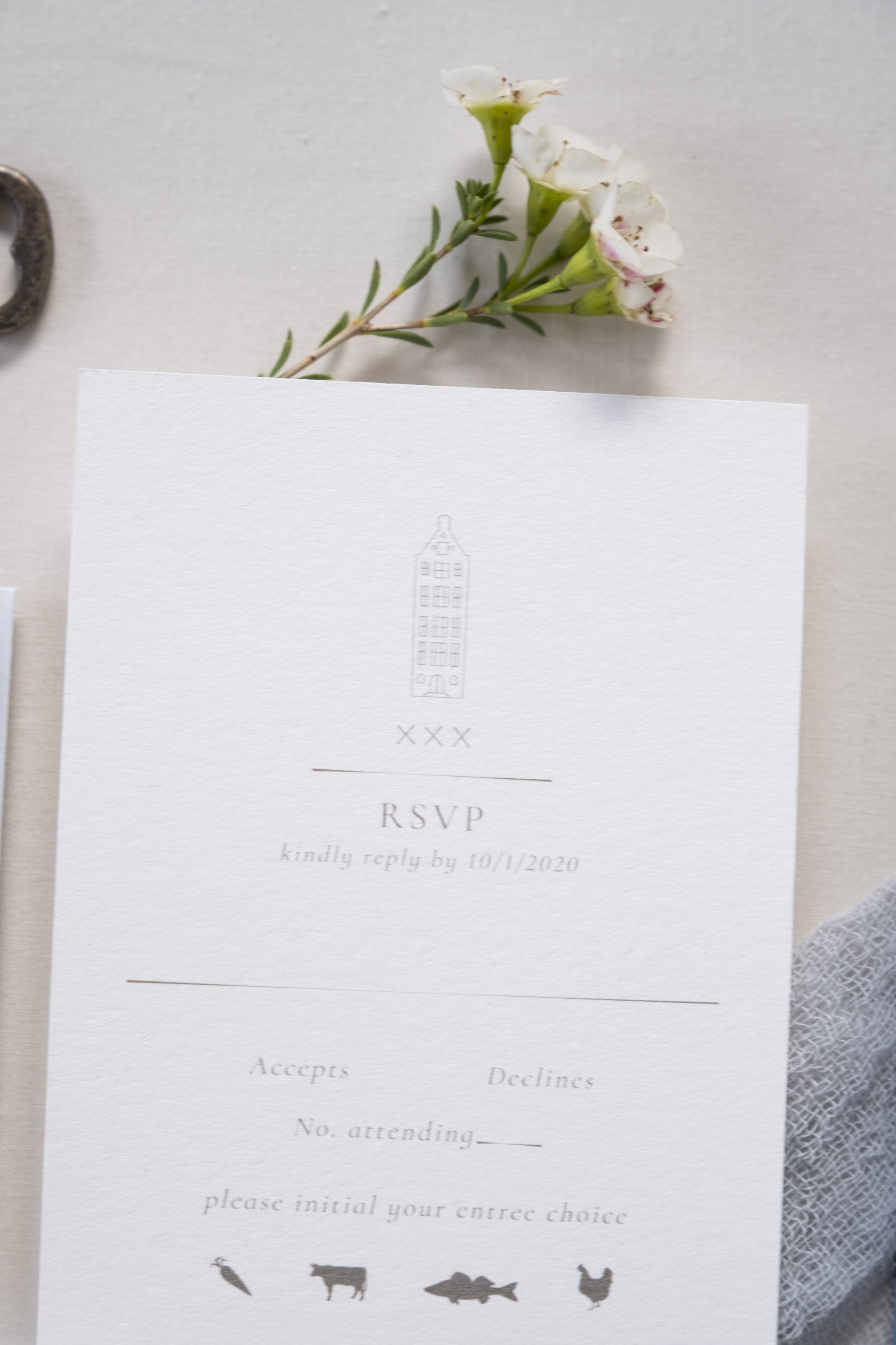
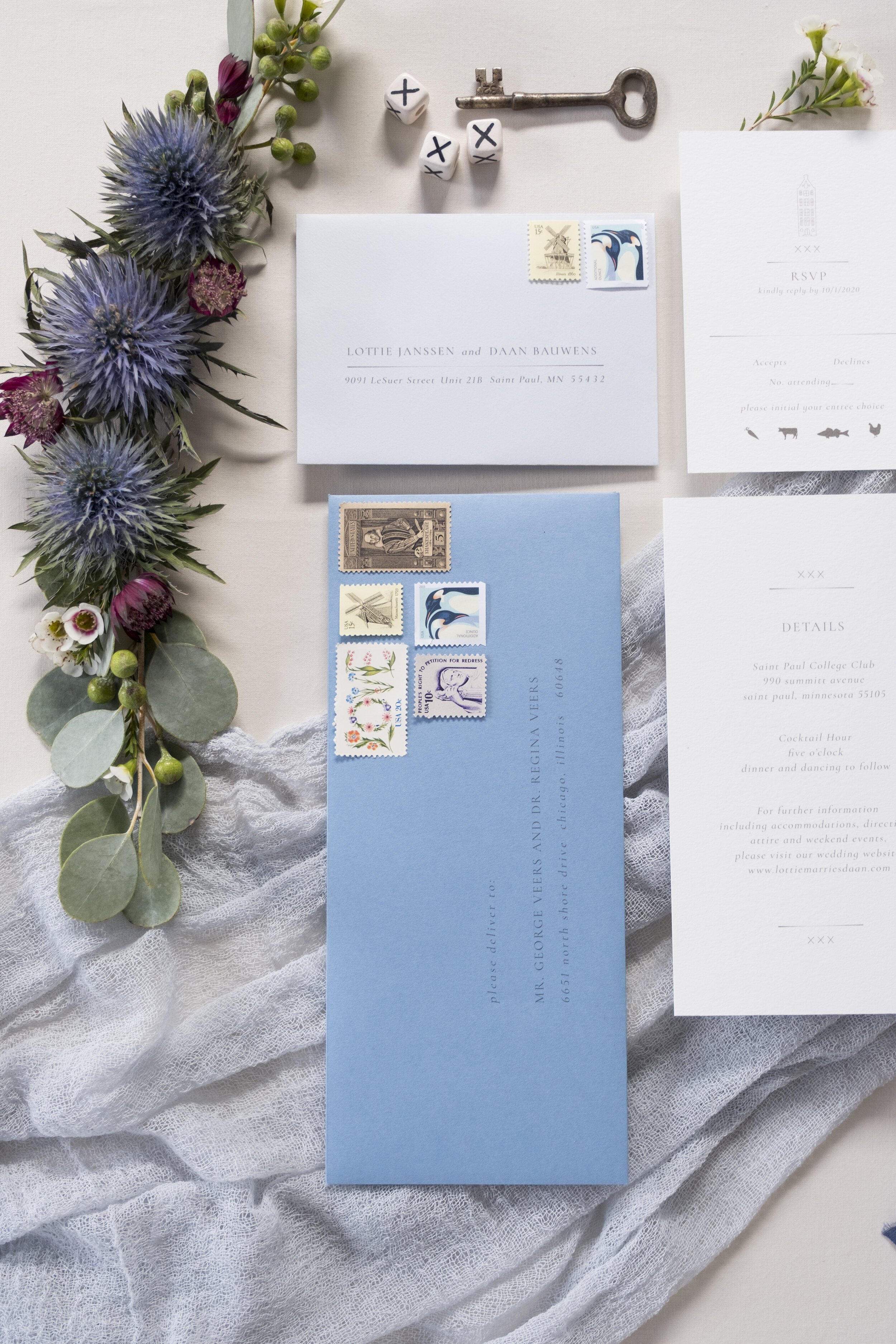
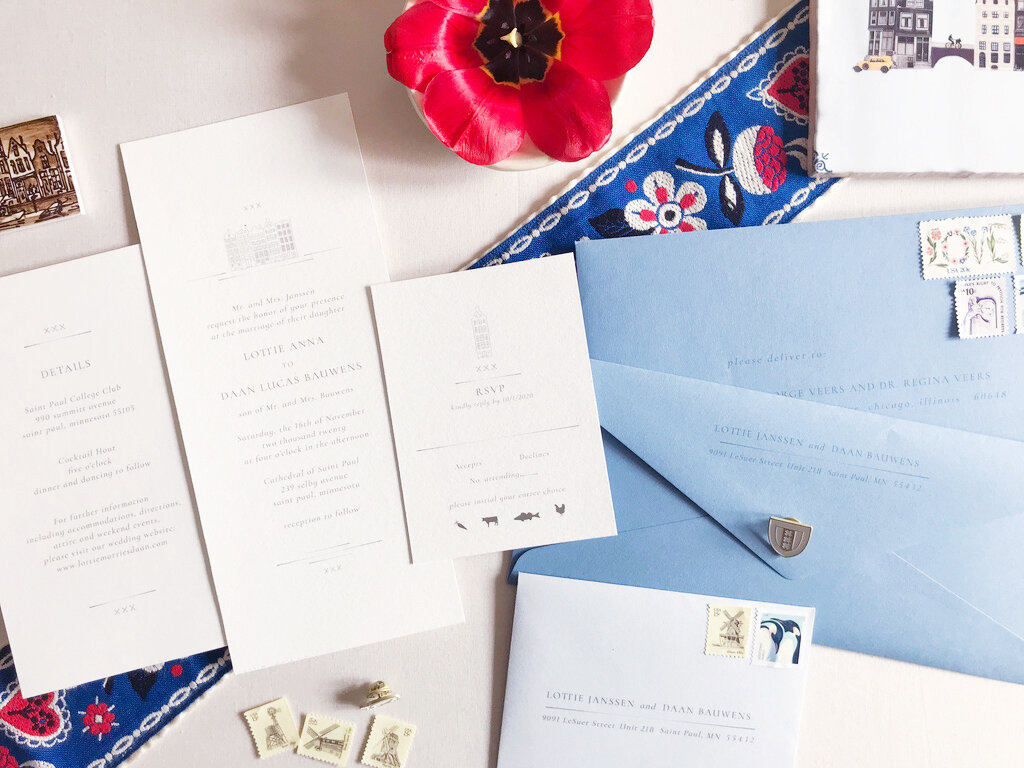
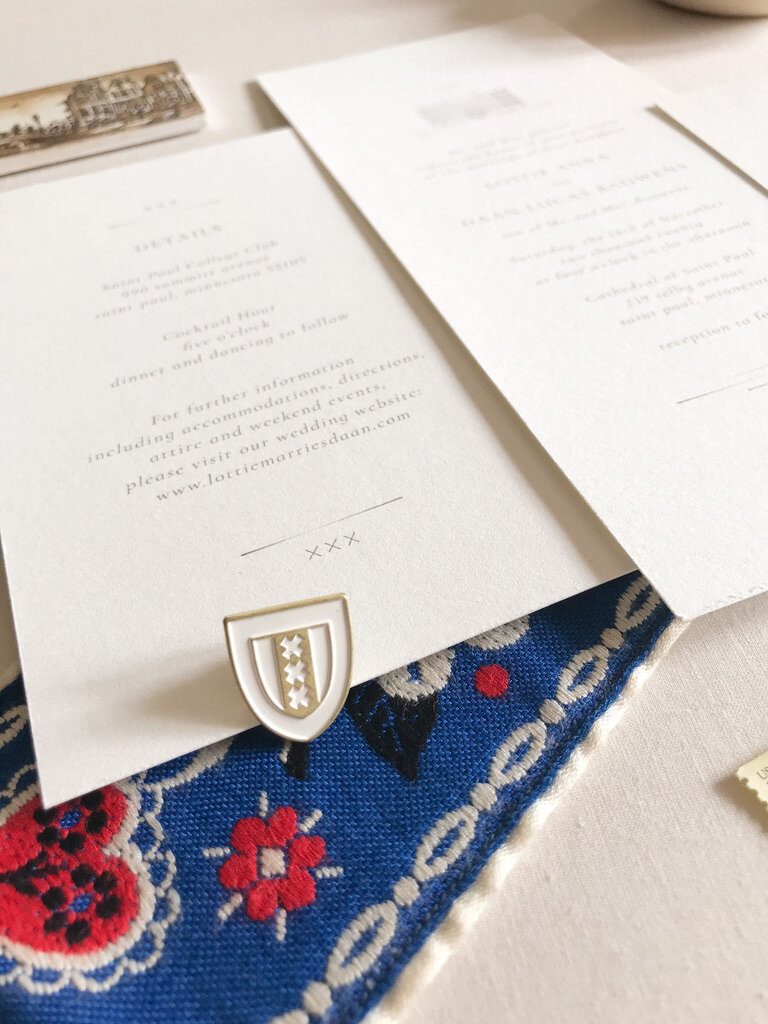
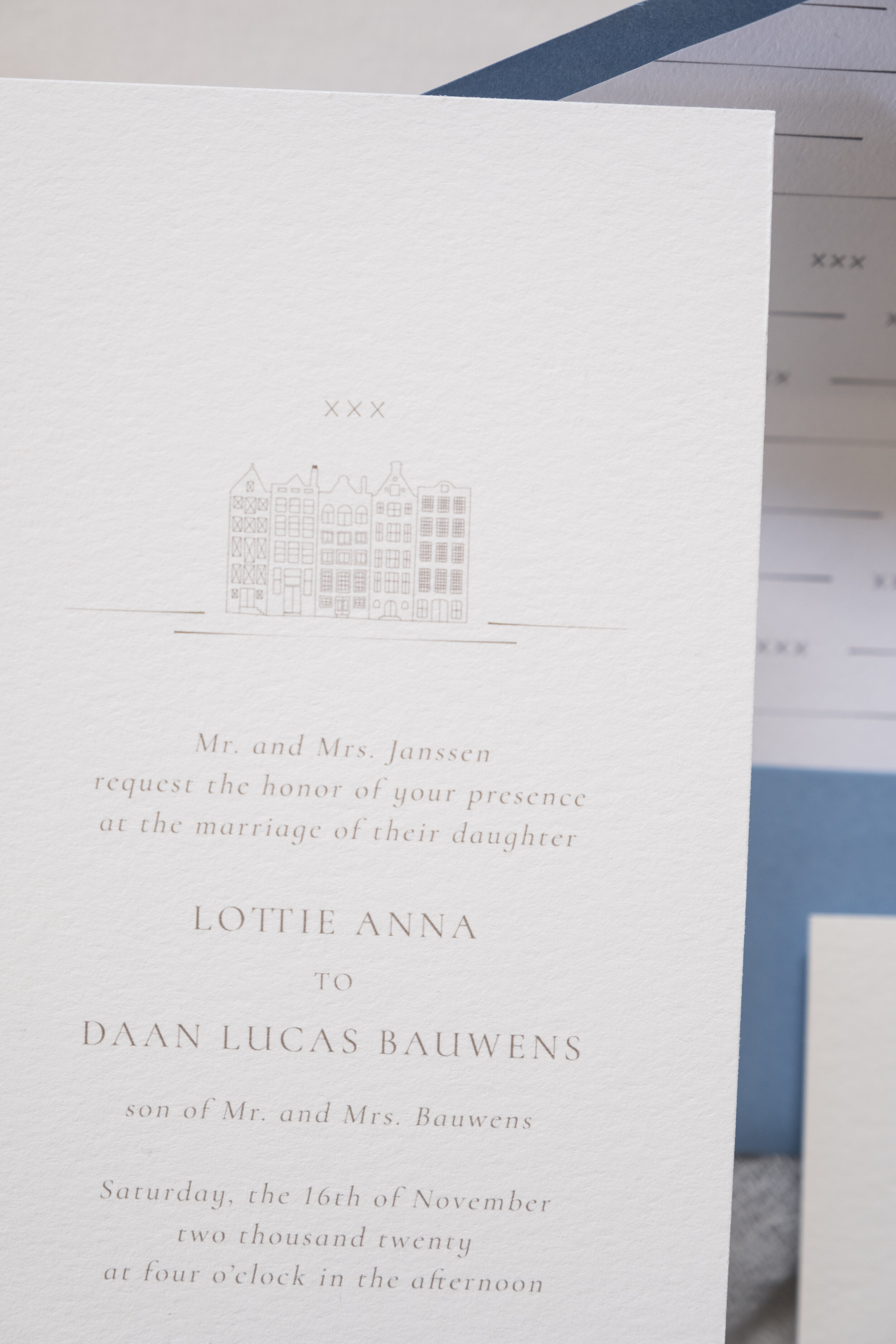
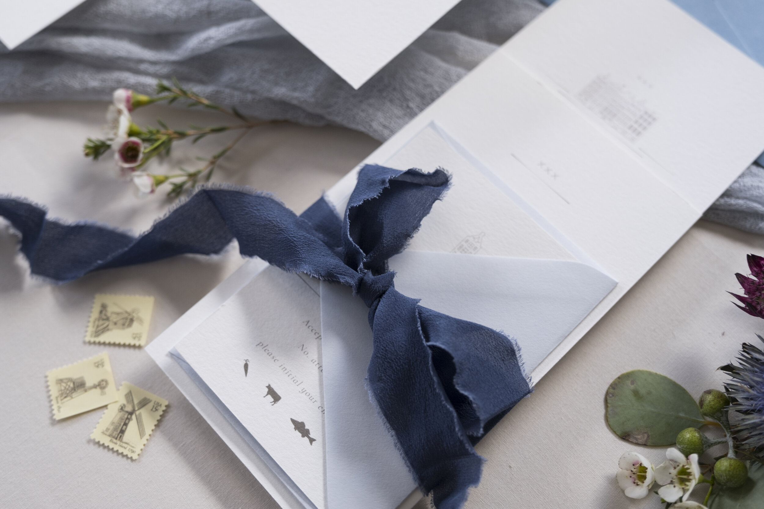
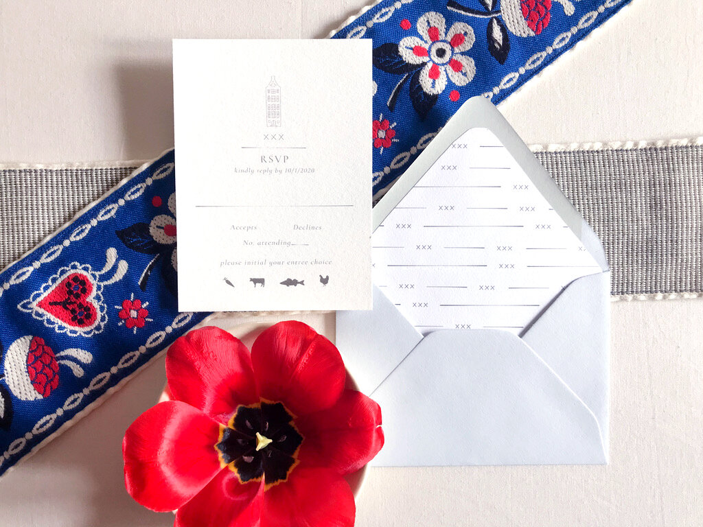
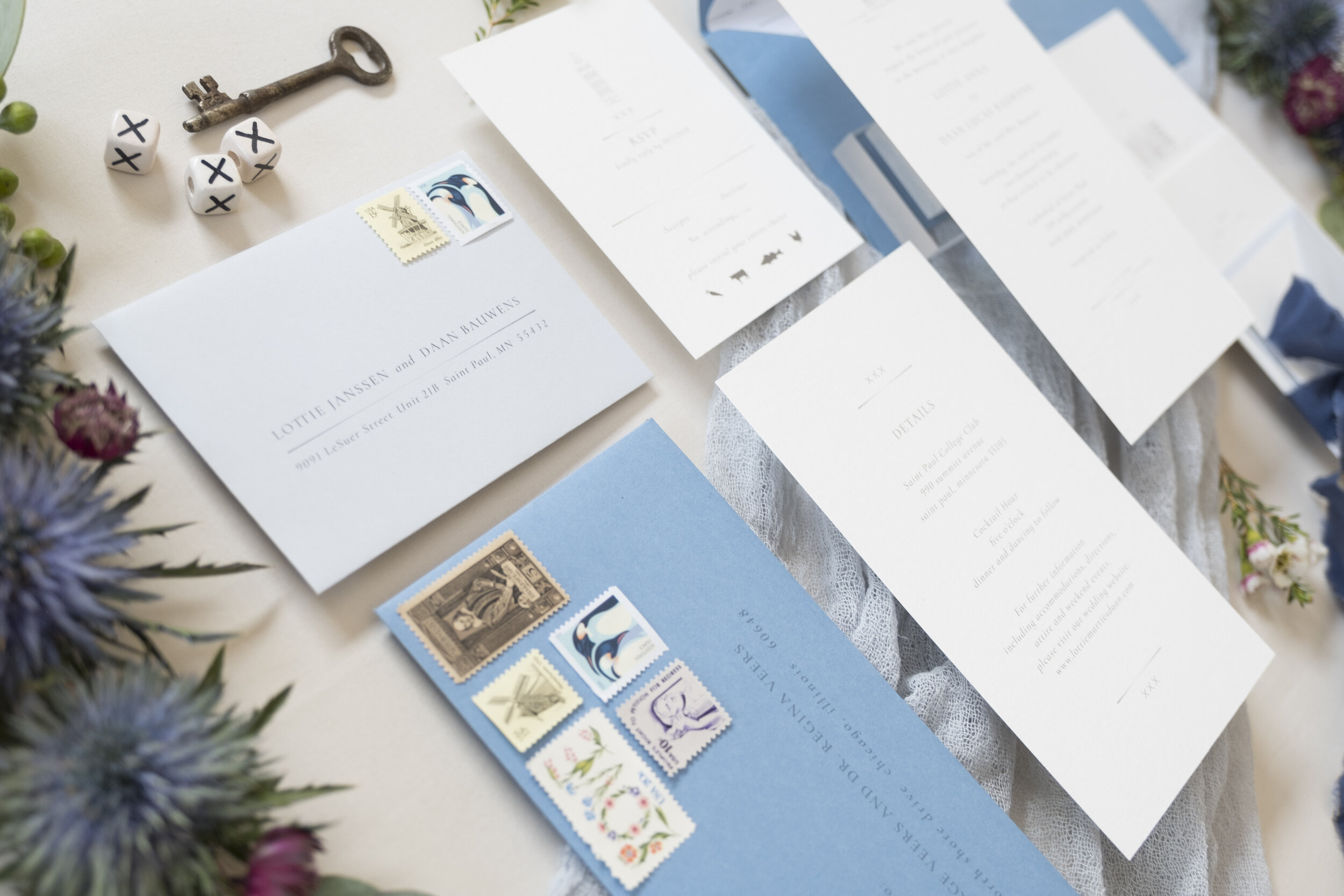
A signature Amsterdam symbol is the three XXX’s which is decorated and celebrated throughout the city as their coat of arms; starting with the flag of Amsterdam. As seen in both vertical and horizontal position, the symbol is classically Amsterdam. There seems to be many guesses as to the meaning of the triple X’s, but the most prevalent is said that they are representative of the cross on which St. Andrew has been crucified, who was a fisherman and apostle.
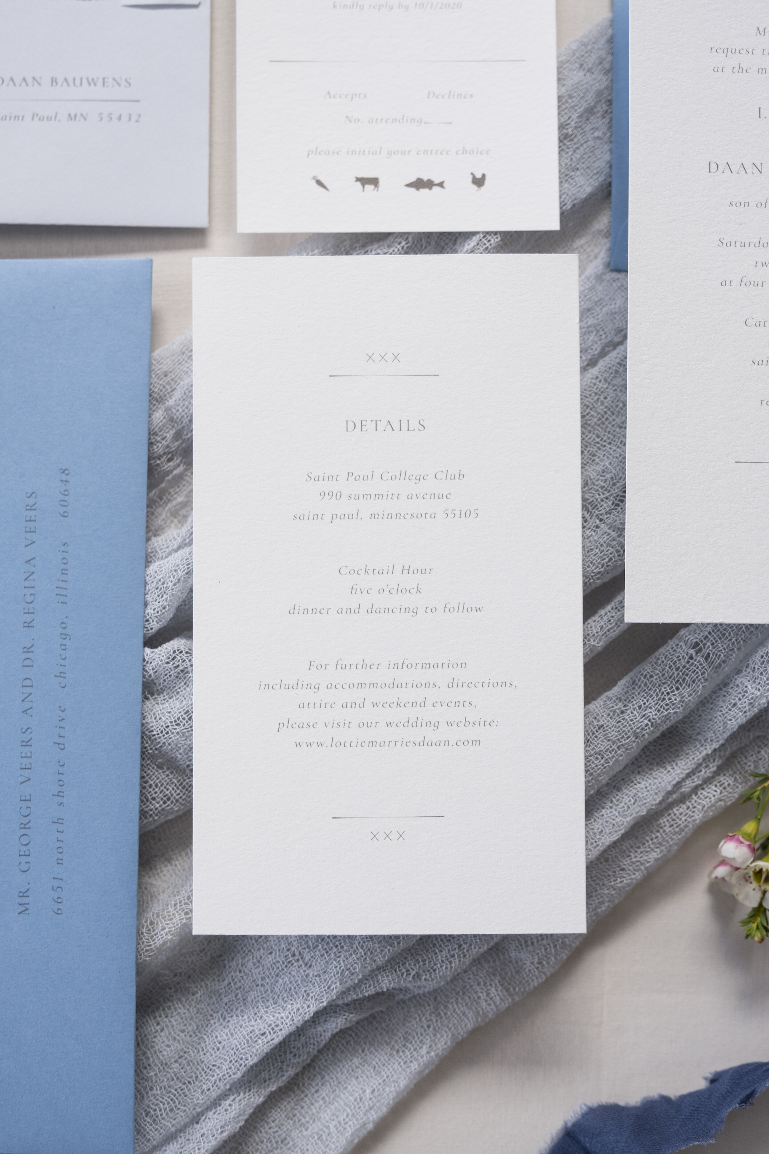
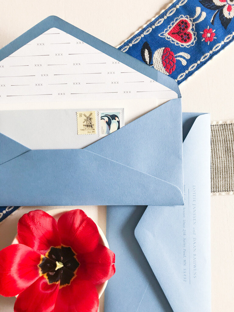
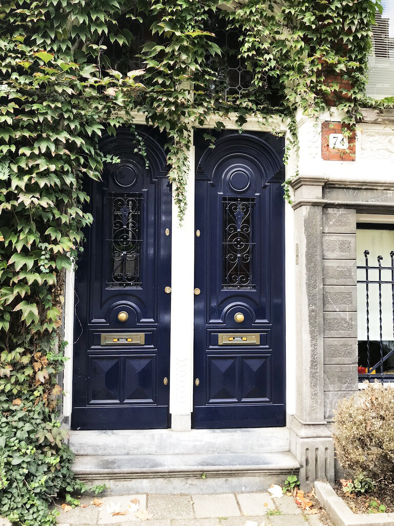
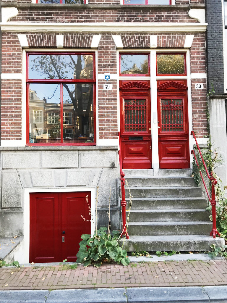
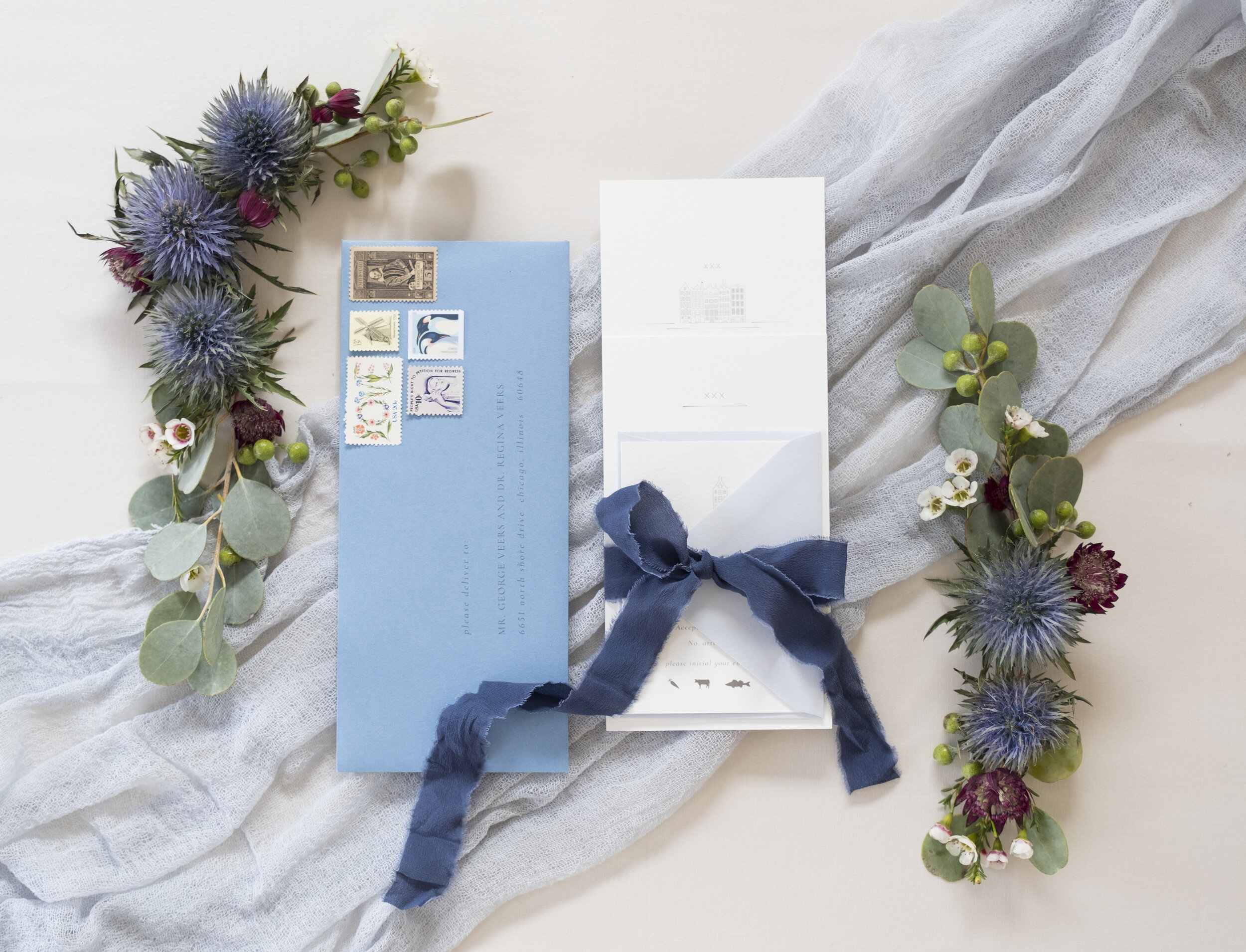
Taking an in-depth look at the Lottie Suite, you are sure to recognize the delicate line-drawing of row houses, including original gables, windows, and doors of each. Most notably, the XXX symbol represented on each invitation insert as well as in the envelope liners. Three shades of blue represent the prevalent amount of water in and around Amsterdam. From the light blue rsvp envelope to the Carolina blue outer envelope to the Cobalt hand-dyed silk ribbon. I chose a simple, serif font that is clean and crisp. By varying the type from lower case to upper case to italicizing, there is enough separation and interest utilizing one single font. The suite wouldn’t be complete without vintage stamps, especially the adorably dainty windmill postage!
So you see, your invitations can be quite literal (and charming) such as the Lottie Suite or a representation of something very special to the both of you, but it most certainly should have meaning!